iOS Screen Patterns: 35 screen types, taken apart
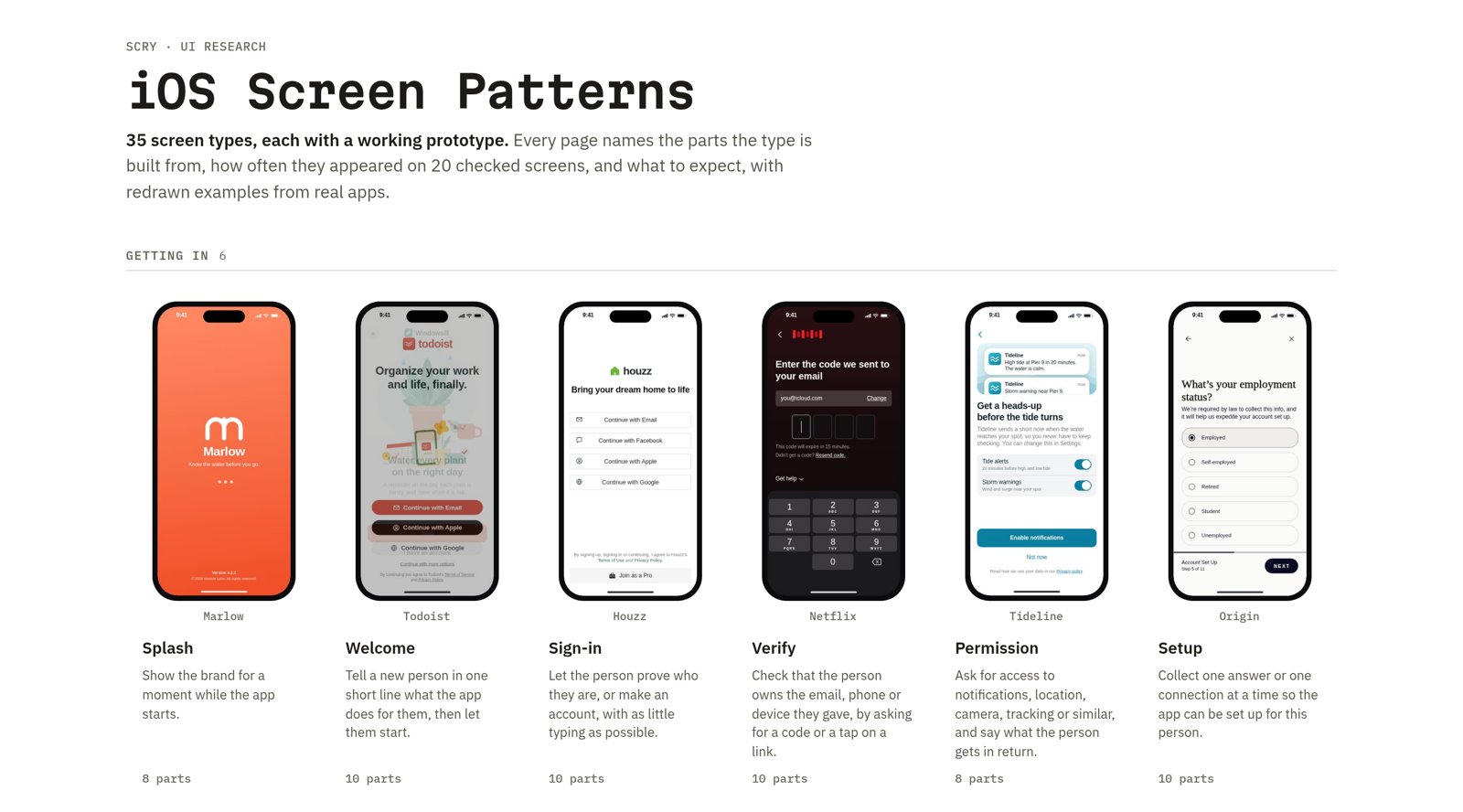
Most iOS screens are one of a few dozen kinds: a sign-in, a paywall, a search, a settings list. Designers know these by feel, but it is hard to find out what a typical paywall actually has on it, or how many of them hide the price until you tap.
So we counted. We sorted 15,435 screens from 644 iOS apps, captured between 2018 and 2025, into 35 screen types. Then we took each type apart. The result is a free site, iOS Screen Patterns, with one page per type.
From 644 iOS apps, 2018 to 2025.
Each with its own page and a working prototype.
From getting in to paying.
One per app, counted part by part.
What is on a page
Each page follows the same layout, borrowed from the old design-pattern books:
- Intent. What the screen is for, in one sentence.
- Motivation. Why apps need it.
- Applicability. How common it is: share of screens, share of apps that have one, the app category that uses it most, and how often it shows up as a sheet or in dark mode.
- Anatomy. The parts the type is built from, with how many of the checked screens had each part.
- Expectations. What most of the checked screens do, with the count behind each one.
- Variants. The common shapes the type takes.
- Pitfalls. Mistakes we saw on real screens, and which apps made them.
Next to the text is a phone you can use. Each page has a made-up app that shows every part of the type at once, plus examples redrawn from real apps. Hover a number on the phone, or a part in the key, to find it on the screen. You can switch between light and dark, and every page has a broken version of the made-up app that shows a pitfall.
One page: Paywall
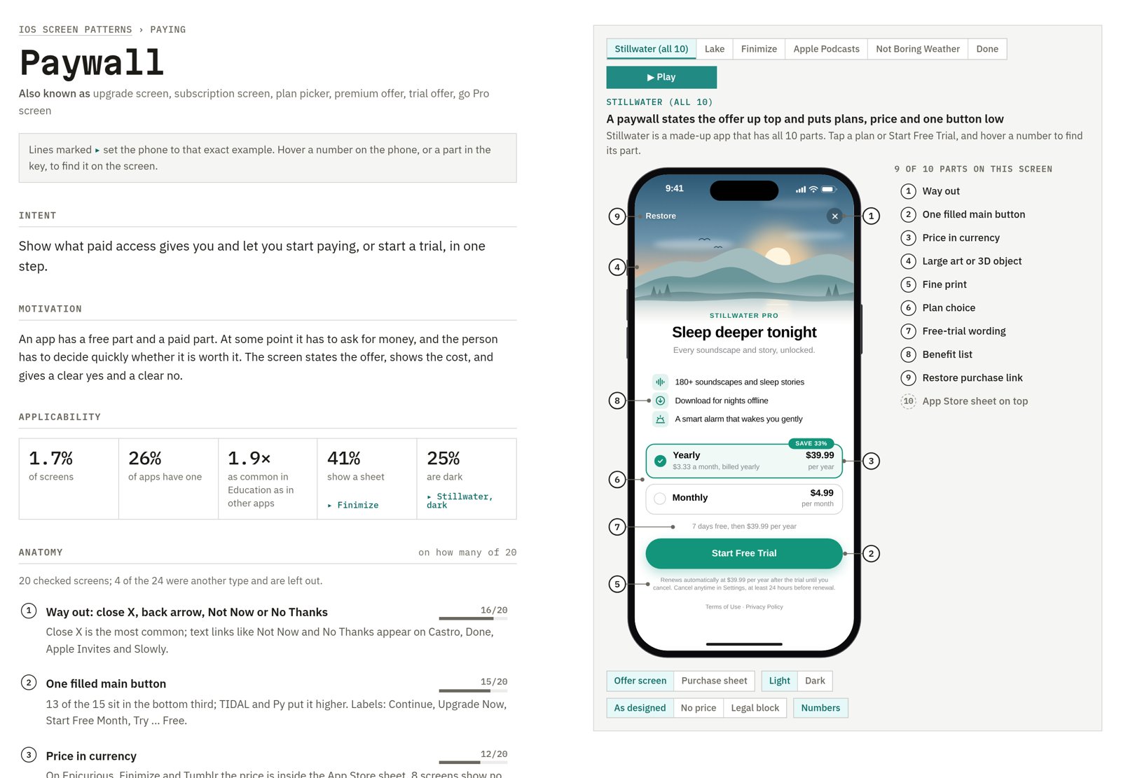
Paywall is a good example. Paywalls make up 1.7% of screens, and 26% of apps have one. They are 1.9 times as common in Education apps as in other apps. 41% show the App Store purchase sheet and 25% are dark.
On the 20 checked paywalls:
- 16 give a way out: a close X, a back arrow, or a Not Now or No Thanks link. TIDAL, Blinkist, Origin and Py show none.
- 15 have a single filled main button, and 13 of those 15 put it in the bottom third.
- 12 show a price in currency. The other 8 rely on words and art and leave the price for the next step.
- All 6 that offer a trial say how long it lasts.
The pitfalls come from the same screens. Castro, Origin, Py and Not Boring Calculator show no price on the offer screen, so the cost only appears after you tap. Done, Lake and Finimize use a faint grey close X that is easy to miss. TIDAL puts a block of small legal text next to the offer, which pushes the plans away from the button that confirms them.
The page's made-up app, Stillwater, has a "No price" version and a "Legal block" version so you can see each mistake on the same screen.
The seven families
The 35 types fall into seven groups by what the person is doing.
| Family | Types | Share of screens | Apps with at least one |
|---|---|---|---|
| Getting in | Splash, Welcome, Sign-in, Verify, Permission, Setup | 17.0% | 95% |
| Finding | Home, Feed, Catalog, Search, Filter, Map | 19.5% | 95% |
| Viewing | Detail, Article, Player, Gallery, Profile | 15.0% | 92% |
| Making and talking | Chat, Inbox, Compose, Camera, Form, Share | 17.8% | 89% |
| Tracking | Calendar, Stats, Activity, List, Notifications | 9.9% | 81% |
| Managing | Settings, Account, Help, Menu | 14.2% | 93% |
| Paying | Paywall, Checkout, Confirmation | 6.3% | 63% |
How we made it
Sorting. A vision model (Gemini) read each app's screens as numbered contact sheets, 12 at a time, and gave every screen one of the 35 types. Those labels give the share of screens and share of apps figures.
Checking. For each type we took about 24 labelled screens, one per app, and read each one: which parts it has, where the main button sits, what the labels say. Screens that turned out to be another type were left out. On Paywall, 4 of the 24 were, so the page counts 20. Most pages count between 17 and 24 screens.
Redrawing. The examples are rebuilt as working prototypes, not screenshots. The app names are real. The art, logos, covers and colours are new, and the signed-in account is always you@icloud.com.
What the numbers are and are not
The anatomy counts come from about 20 screens per type. That is enough to see what is common and to find real mistakes, but not enough to rank small differences. A part seen on 12 of 20 screens and one seen on 10 of 20 are about equally common.
The counts describe what apps do, not what is right. A pitfall is listed because it makes the screen harder to use, not because it is rare.
The screens run from 2018 to 2025, so some apps have changed since they were captured.
Try it
The site is at patterns.scrymore.com. Start with a type you are designing this week, set the phone to each example, and compare the anatomy counts with your own screen.